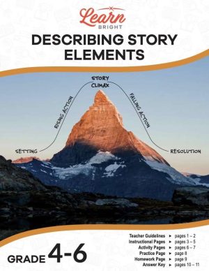

Description
What our Histograms lesson plan includes
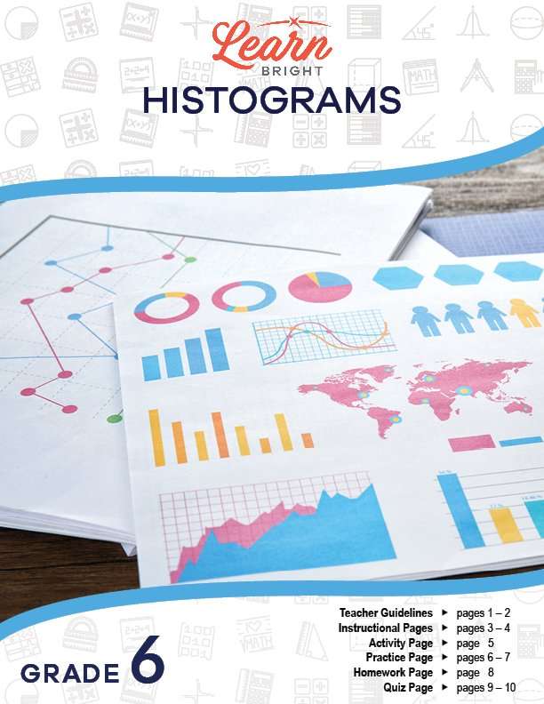
Lesson Objectives and Overview: Histograms introduces students to histograms, a visual representation of numerical statistical data. Students will review the steps to collecting, organizing, and analyzing data. At the end of the lesson, students will be able to interpret and create histograms from data that they collect or is provided for them. This lesson is for students in 6th grade.
Classroom Procedure
Every lesson plan provides you with a classroom procedure page that outlines a step-by-step guide to follow. You do not have to follow the guide exactly. The guide helps you organize the lesson and details when to hand out worksheets. It also lists information in the blue box that you might find useful. You will find the lesson objectives, state standards, and number of class sessions the lesson should take to complete in this area. In addition, it describes the supplies you will need as well as what and how you need to prepare beforehand.
Options for Lesson
Included with this lesson is an “Options for Lesson” section that lists a number of suggestions for activities to add to the lesson or substitutions for the ones already in the lesson. One optional addition to this lesson is to have your students create their histograms by hand. You can also have students open various packages of pretzels and cereal and count the items to create a histogram using the data they collect. For a larger group project, you could have groups of your students create a survey and poll the school. Finally, you can suggest that the administration use the student projects to study the impact or ideas of a new plan with the student body.
Teacher Notes
The teacher notes page includes lines that you can use to add your own notes as you’re preparing for this lesson.
HISTOGRAMS LESSON PLAN CONTENT PAGES
Histograms
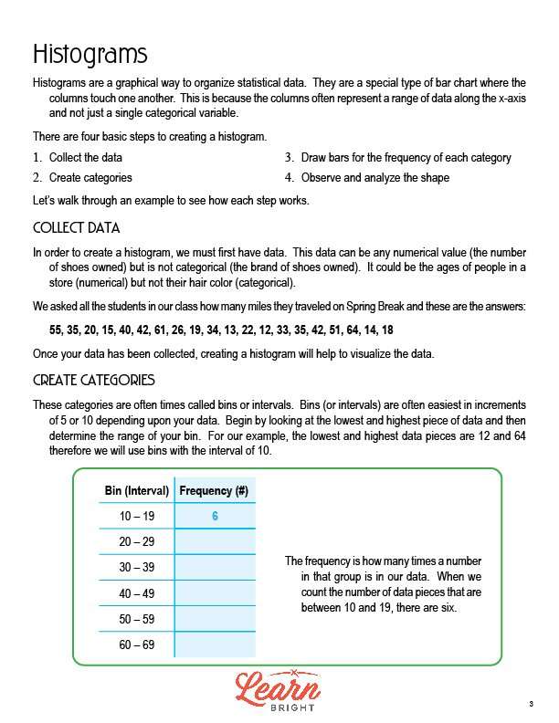
The Histograms lesson plan includes two pages of content. A histogram is a graphical way to organize statistical data. Histograms are bar charts where the columns touch each other. Each column represents a range of data along the x-axis instead of a single categorical variable.
You can create a histogram using four steps. First, collect your data. Second, create categories. Third, draw bars for the frequency of each category. Fourth, observe and analyze the shape of the graph. The lesson walks through each of the steps one-by-one in more detail.
Collect Data
The first step in creating a histogram is to collect data. Your data needs to be a numerical value (for example, the number of shoes owned) instead of categorical (for example, the brand of shoes owned).
For example, say you asked all of the students in your class how many miles they traveled during Spring Break. These might be their answers: 55, 35, 20, 15, 40, 42, 61, 26, 19, 34, 13, 22, 12, 33, 35, 42, 51, 64, 14, 18. You can use this data because it is numerical instead of categorical.
Create Categories
The next step is to create your categories, also sometimes called bins or intervals. It is often easiest for each bin or interval to be in increments of 5 or 10, depending on your data. To start, you should look at the highest and lowest data points. Next, use that information to determine the range for your bin.
For example, when looking at the spring break data from above, the highest data point is 64 and the lowest is 12. Therefore, it makes sense to use bins with an interval of 10.
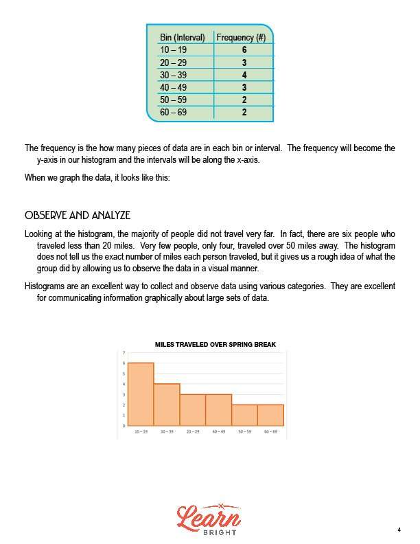
The lesson shows a chart with the bin (interval) on the left and the frequency on the right. The frequency is how many times a number in your data set falls into a specific bin. For example, to find the frequency for the 10-19 bin, you count all of the numbers in the data set that falls in that range. In this case, the frequency for the 10-19 bin in 6. The frequency becomes the y-axis in your histogram. The intervals will be along the x-axis.
Observe and Analyze
Once you create your histogram, you can start to analyze it. When you look at the spring break histogram, you can see that most students did not travel far. Only four people traveled over 50 miles away. It’s important to note that the histogram does not tell you the exact number of miles each person traveled, but instead gives you a general idea of the trends of the group as a whole, presented visually.
Histograms are a great way to collect and display data in different categories. You can use them to communicate information graphically about large data sets.
HISTOGRAMS LESSON PLAN WORKSHEETS
The Histograms lesson plan includes four worksheets: an activity worksheet, a practice worksheet, a homework assignment, and a quiz. You can refer to the guide on the classroom procedure page to determine when to hand out each worksheet.
EXCEL HISTOGRAMS ACTIVITY WORKSHEET
The activity worksheet asks students to create a histogram in Excel using the data collected as a class. They will collect this data using the three data collection questions printed on the worksheet. They will then print out their graphs. The worksheet includes step-by-step instructions for creating their histograms in Excel.
FREQUENCY TABLE TO HISTOGRAM PRACTICE WORKSHEET
For the practice worksheet, students will use the data on the worksheet to first create a frequency table and then transform it into a histogram using the graph on the worksheet.
HISTOGRAMS HOMEWORK ASSIGNMENT
The homework assignment asks students to collect data from 15 people in their neighborhood using the two questions printed on the worksheet. They will also create a third question. Once they’ve surveyed their neighbors, they will construct histograms of the data and attach them to their data collect sheet.
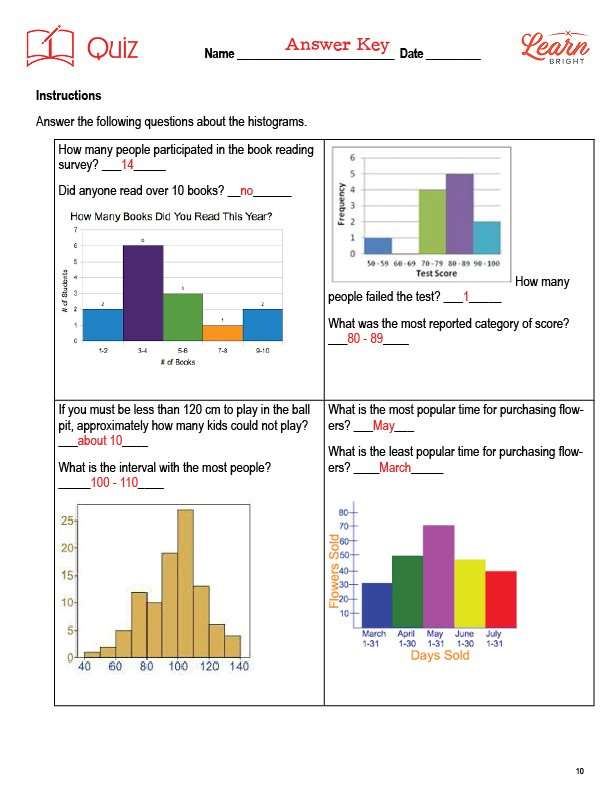
QUIZ
This lesson also includes a quiz that you can use to test students’ understanding of the lesson material. For the quiz, students will answer questions about four different histograms.
Worksheet Answer Keys
This lesson plan includes answer keys for the practice worksheet and the quiz. If you choose to administer the lesson pages to your students via PDF, you will need to save a new file that omits these pages. Otherwise, you can simply print out the applicable pages and keep these as reference for yourself when grading assignments.