
Description
What our Displaying Numerical Data Advanced lesson plan includes
Lesson Objectives and Overview: Displaying Numerical Data Advanced teaches students how to create three kinds of graphs to display data. Students will learn about box plots, dot plots, and histograms. By the end of the lesson, they will be able to gather data and create all three graphs to display the information. This lesson is for students in 6th grade.
Classroom Procedure
Every lesson plan provides you with a classroom procedure page that outlines a step-by-step guide to follow. You do not have to follow the guide exactly. The guide helps you organize the lesson and details when to hand out worksheets. It also lists information in the yellow box that you might find useful. You will find the lesson objectives, state standards, and number of class sessions the lesson should take to complete in this area. In addition, it describes the supplies you will need as well as what and how you need to prepare beforehand. The materials you need for this lesson are sticky notes or index cards, which students will use during the activity.
Options for Lesson
You can take advantage of the suggestions in the “Options for Lesson” section that offers additional activities or ideas to incorporate into the lesson plan. Graphs are in nearly everything we see, whether in science textbooks, on TV news, or even in social media. Teachers are encouraged to review basic statistical concepts like mean, mode, frequency, and media. Then review the types of graphs and how best to use them before teaching this lesson. Learn Bright has several lessons on statistics and graphs that are very useful as a review or introduction for this lesson.
Teacher Notes
The teacher notes page provides an extra paragraph of information to help guide the lesson. It suggests teaching this lesson in conjunction with others that relate to graphing or presenting data. You can use the blank lines to write down any other ideas or thoughts you have about the topic as you prepare.
DISPLAYING NUMERICAL DATA ADVANCED LESSON PLAN CONTENT PAGES
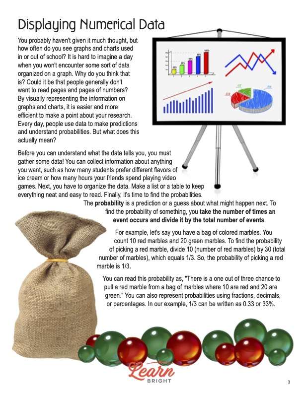
Displaying Numerical Data
The Displaying Numerical Data Advanced lesson plan contains seven pages of content. You probably haven’t given it much thought, but how often do you see graphs and charts used in or out of school? It is hard to imagine a day when you won’t encounter some sort of data organized on a graph. Why do you think that is? Could it be that people generally don’t want to read pages and pages of numbers? By visually representing the information on graphs and charts, it is easier and more efficient to make a point about your research. Every day, people use data to make predictions and understand probabilities. But what does this actually mean?
Before you can understand what the data tells you, you must gather some data! You can collect information about anything you want, such as how many students prefer different flavors of ice cream or how many hours your friends spend playing video games. Next, you have to organize the data. Make a list or a table to keep everything neat and easy to read. Finally, it’s time to find the probabilities.
The probability is a prediction or a guess about what might happen next. To find the probability of something, you take the number of times an event occurs and divide it by the total number of events. For example, let’s say you have a bag of colored marbles. You count 10 red marbles and 20 green marbles. To find the probability of picking a red marble, divide 10 (number of red marbles) by 30 (total number of marbles), which equals 1/3. So, the probability of picking a red marble is 1/3.
You can read this probability as, “There is a one out of three chance to pull a red marble from a bag of marbles where 10 are red and 20 are green.” You can also represent probabilities using fractions, decimals, or percentages. In our example, 1/3 can be written as 0.33 or 33%.
Understanding Variables
Once you find the probabilities, you can make predictions! Suppose you know the probability that something will happen. In that case, you can guess the chances that it will occur in the future. Remember, probabilities are not certainties; they’re just educated guesses based on your data. Think about the weather. How many times has the chance of rain been less than 50%, but it still rained? Or the chance of rain was 75%, and it didn’t rain? Probability gives us an idea that something may occur.
However, events or variables can affect the probability of something happening. In the case of weather, maybe the wind changes directions, blowing the rain clouds in a different direction. Some variables you can control while others you cannot. Knowing the variables we can control and those out of our control is part of interpreting your data. Doing this helps us understand data better and make informed decisions. Math allows us to make predictions and see the likelihood of different outcomes.
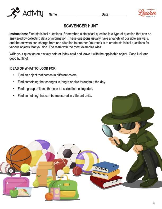
Statistical Questions
A statistical question is a type of question that can be answered by collecting data or information. These questions usually have a variety of possible answers, and the answers can change from one situation to another. To recognize a statistical question, look for questions that start with words like how many, how often, what is the average, or which group. These questions can have different answers depending on the data you collect.
The lesson lists three statistical questions. Each one has an explanation next to it to help students see why that question is statistical. One question is, “Which group of pets is the most popular?” This is a statistical question because people have different types of pets, and we need to gather data to determine the most popular group.
Why is this important? Statistical questions are super important because they help us gather data, analyze information, and make informed decisions. They’re like detective questions that lead us to discover interesting facts and patterns! So, next time you come across a question that can be answered by collecting data with multiple possible answers, you’ll know it’s a statistical question. Statistics empowers us to think critically, be curious, and use math to explore the world around us.
Types of Data
There are two main types of data: categorical and numerical. Categorical data is information that falls into categories or groups. These categories can be things like colors, types of animals, or favorite sports. To recognize categorical data, look for information that can be sorted into groups or labels. For example, asking people what their favorite color is will yield answers like red, blue, and green. That’s categorical data.
Numerical data, on the other hand, deals with numbers and quantities. Sometimes teachers will call numerical data quantitative because it includes measurements, scores, or ages. To recognize numerical data, look for answers that involve numbers. For example, if you ask your friends how many siblings they have, you will get answers like two, one, or none. That’s numerical data.
Examples of categorical data include colors of crayons in a box, types of fruits, and names of students in a class. Numerical data includes things like students’ heights, people’s ages in a family, and scores on a math test. Why is this important? Understanding the difference between categorical and numerical data helps us organize and analyze information better. It’s like sorting things into different baskets to know what we have!
Shape in Data
The shape of data distribution refers to how the data is spread out or organized. Imagine you have several scores from a test, and you want to see if most students did well or if the scores are all over the place— that’s the shape of the data! There are three main types of shapes we look for in data distributions: symmetrical, skewed right, and skewed left.
If the data is evenly distributed on both sides of the center, it’s symmetrical. Think of this shape like a mirror image. For example, if most students score around 80, with a few above and below, that’s symmetrical. If the data has a tail extending to the right, it’s skewed right. It means some scores are higher than the rest, pulling the data to the right side. If the data has a tail extending to the left, it’s skewed left. It means some scores are lower than the rest, pulling the data to the left side.
The lesson provides six graphs to represent different scenarios. According to the shape of those graphs, students can figure out which ones have each of the three shapes. Why is this important? Understanding the shapes of data sets helps us sense information and spot patterns. It’s like looking at a puzzle and figuring out how all the pieces fit together.
Probability
To review, what is probability? Probability is a fancy word to refer to the chance that something will happen. In other words, it helps us predict how likely it is that an event will occur. To understand probability, we use numbers between 0.0 and 1.0. If the probability is 0.0, the event is impossible—it won’t happen at all. If the probability is 1.0, it means the event is certain—it will happen for sure.
Let’s do a simple experiment to demonstrate probability. Use a coin toss. When you flip a fair coin, there are two possible outcomes: it will land on either heads or tails. The possibility of getting heads is 0.5 (1/2 or 50%) because there’s an equal chance that it will land on heads and tails. The more you flip the coin, the more accurate the prediction becomes. This is known as the law of large numbers. You can also use words to describe probability: impossible, unlikely, likely, certain.
When the probability is 0.0, the event can’t happen. For example, rolling a 7 with a six-sided number cube is impossible. When the probability is close to 0.0, it means the event is not very likely to happen, but there’s still a tiny chance. An event is likely to happen when the probability is close to 1.0, but there is still a slight chance it won’t. And when a probability is 1.0, that event is guaranteed to happen. Why is this important? Understanding probability helps us make informed decisions, play games strategically, and explore the world with a curious mind!
Types of Data Displays
What are data displays? Data displays are like unique pictures or graphs that help us see information and patterns in data. They make it easy for us to understand and compare different data sets. There are several types of data displays that mathematicians can use. The lesson describes four types of displays that students commonly see: bar graphs, line graphs, pie charts, and histograms.
Bar graphs use rectangular bars to represent different categories of data. The height of each bar shows the quantity or amount of data in that category. Line graphs use points connected by lines to show how data changes over time. They are great for tracking trends and patterns. You can think of pie charts as yummy pizzas! Pie charts use “slices” to show how a data set is divided into parts or percentages. Finally, histograms are similar to bar graphs but group numerical data into intervals or ranges.
How do we choose the correct data display? It depends on the type of data and the story we want to tell. If we’re going to compare categories, we use bar graphs. If we want to track changes over time, we use line graphs. And if we’re going to show how parts make up a whole, we use pie charts. The lesson again provides examples of scenarios that use different displays.
Describing Data Sets
There are several ways to describe numerical data. A quick way is to find a data set’s central tendency. Measures of central tendency include the mean, median, and mode. The mean is the average. To find the mean, add all of the numbers. Then divide by the total number of numbers. In the example on the page, the sum of the numbers equals 70, and there are 10 numbers in the set. 70 ÷ 10 = 7. Your mean or average, then, is 7. Students should recognize that the average doesn’t have to be a number in the set, and most often, it is not.
The median is the middle number. We must first put the numbers in order from smallest to greatest to find the median. Using the same data set, we see that there are six 5s and four 10s. Students will see that there are two numbers are in the middle. (This happens when you have an even number of objects or numbers in the data set.) There are four numbers on each side of the middle. First, we add the numbers together: 5 + 5 = 10. Then we divide by 2: 10 ÷ 2 = 5. The median, then, is 5.
The mode is the number that appears most frequently. If you put the number in order from least to greatest, finding the mode is easy! Using the same data set above, we find that the number 5 appears most frequently. So the number 5 is the mode.
Why is this important? Understanding data displays helps us communicate information visually and tell stories with data. It’s like using art to make numbers come to life! With this knowledge, we can be data artists and use graphs to present data in exciting and meaningful ways.
DISPLAYING NUMERICAL DATA ADVANCED LESSON PLAN WORKSHEETS
The Displaying Numerical Data Advanced lesson plan includes three worksheets: an activity worksheet, a practice worksheet, and a homework assignment. Each one will help students solidify their grasp of the material they learned throughout the lesson. You can refer to the classroom procedure guidelines to know when to hand out each worksheet.
SCULPT AND DRAW ACTIVITY
For the activity worksheet, students will use play doh to sculpt an object. They will use whatever colors are available. The sculpture can be big or small. (Make sure students know not to use so much that there isn’t enough for everyone at the table.) Next, they will weight the play doh object on a scale. Then they will record the information on the worksheet. At the bottom, they will draw their sculptures in the empty box.
The second worksheet has several tables. Students will use the first table to gather all the different weights of their objects. The second table measure number of colors. The third table measures length in centimeters. Students will create a box plot, a histogram, and a dot plot on a separate sheet of paper using a different variable for each one.
FARMER’S POTATOES PRACTICE WORKSHEET
The practice worksheet contains a word problem about a farmer and his potatoes. Students will read the word problem and analyze the data. Using the data in the table, they will create a box plot, a histogram, and a dot plot. They can use extra paper if they need more blank space.
DISPLAYING NUMERICAL DATA ADVANCED HOMEWORK ASSIGNMENT
For the homework assignment, students will pick a topic and gather 10 to 15 data points. They will write the data in the table on the worksheet. The instructions list a website for them to go to for reference. Students will create a dot plot and a histogram on the computer and email them for credit. Finally, they will draw a box plot on the worksheet.