
Description
What our Data Collection and Distribution lesson plan includes
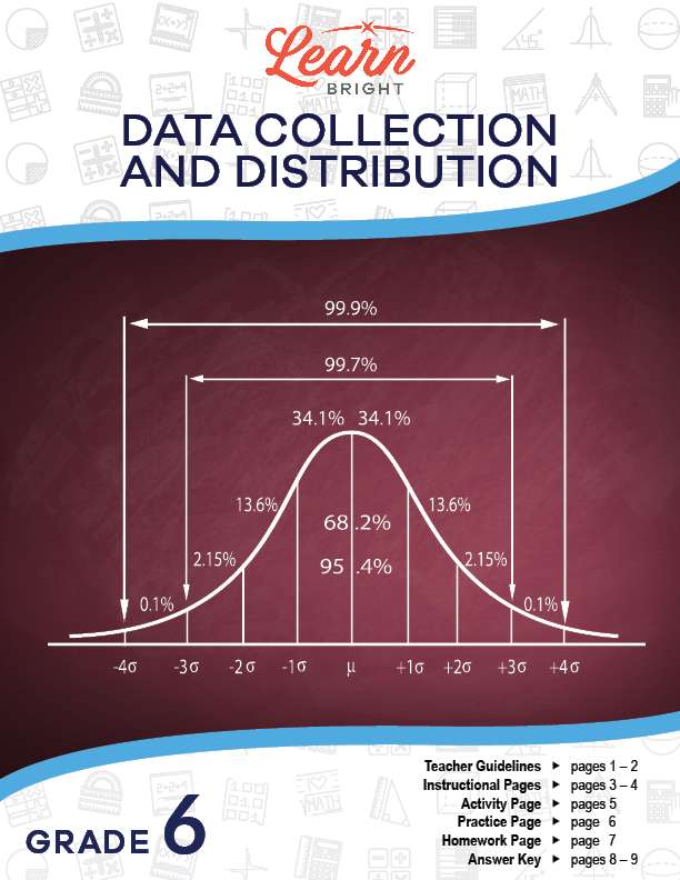
Lesson Objectives and Overview: Data Collection and Distribution teaches students about data and how it can be collected and distributed. At the end of the lesson, students will be able to understand that a set of data has a distribution which can be described by its center, shape, and spread. This lesson is for students in 6th grade.
Classroom Procedure
Every lesson plan provides you with a classroom procedure page that outlines a step-by-step guide to follow. You do not have to follow the guide exactly. The guide helps you organize the lesson and details when to hand out worksheets. It also lists information in the blue box that you might find useful. You will find the lesson objectives, state standards, and number of class sessions the lesson should take to complete in this area. In addition, it describes the supplies you will need as well as what and how you need to prepare beforehand.
Options for Lesson
Included with this lesson is an “Options for Lesson” section that lists a number of suggestions for activities to add to the lesson or substitutions for the ones already in the lesson. One optional addition to this lesson is to have your students compare and contrast graphs throughout the class to see different distributions. You can also provide students with a center, shape, and spread and have them construct the graph to match.
Teacher Notes
The teacher notes page includes a paragraph with additional guidelines and things to think about as you begin to plan your lesson. This page also includes lines that you can use to add your own notes as you’re preparing for this lesson.
DATA COLLECTION AND DISTRIBUTION LESSON PLAN CONTENT PAGES
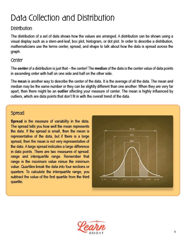
Distribution
The Data Collection and Distribution lesson plan includes two content pages. When we talk about the distribution of a set of data, we’re talking about the way in which the values are arranged. We can show distributions using a visual display, like a stem-and-leaf, box plot, histogram, or dot plot. Mathematicians describe distributions using the terms center, spread, and shape. These terms describe how the data is spread across the graph.
Center
We call the center of a distribution just that—the center! The median is the center value of the data points in ascending order with half on one side and half on the other side.
We can also describe the center of the data using the mean. The mean is the average of all of the data. Sometimes, the mean and median are the same number, but sometimes they are not. If they’re very far apart, this might mean that you have an outlier affecting the measure of your center. Outliers, or data points that don’t fit in with the overall trend of the data, can heavily influence the mean.
Spread
When we look at the measure of variability in the data, we’re looking at the spread. The spread indicates how well the mean represents the data overall. If we have a small spread, the mean is representative of the data. If we have a large spread, the mean is not very representative of the data.
We measure spread in two ways: range and interquartile range. Range is the maximum value minus the minimum value. We can use quartiles to break the data into four sections, or quarters. If you want to calculate the interquartile range, you need to subtract the value of the first quartile from the third quartile.
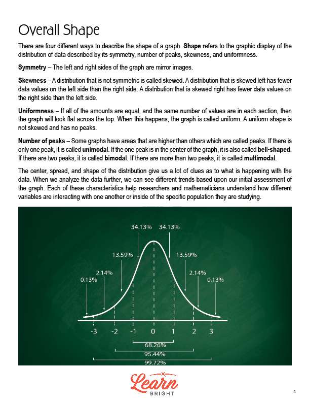
Overall Shape
We can describe the shape of a graph in four different ways. The shape is the graphic display of the distribution of data. We describe shape by its symmetry, number of peaks, skewness, and uniformness.
Symmetry is when the left and right sides of the graph are mirror images. Skewness is when there is a distribution that is not symmetric. A distribution that is skewed left has fewer data values on the left side than the right side. A distribution that is skewed right has fewer data values on the right side than the left side.
Uniformness is when all of the amounts are equal and the same number of values are in each section. In these cases, the graph looks flat across the top. These are not skewed and have no peaks.
We also look at the number of peaks, or areas that are higher than others. If it has only one peak, we call it unimodal. If the one peak is in the center of the graph, we also call it bell-shaped. Next, if there are two peaks, we call it bimodal. If there are more than two peaks, we call it multimodal.
By looking at the center, spread, and shape of the distribution, we can learn a lot about the data. When we look closely at the data, we can see trends reflected in the graph. Researchers and mathematicians use these characteristics to better understand how the different variables interact with each other inside of the population they’re studying.
DATA COLLECTION AND DISTRIBUTION LESSON PLAN WORKSHEETS
The Data Collection and Distribution lesson plan includes three worksheets: an activity worksheet, a practice worksheet, and a homework assignment. You can refer to the guide on the classroom procedure page to determine when to hand out each worksheet.
PENCILS ACTIVITY WORKSHEET
Students will work in groups to complete the lesson activity. Each group will measure the length of their pencils and write down their results in a table, rounding their measurements to the nearest inch. They will then create either a bar graph or histogram using a computer. Next, they will calculate the mean, median, mode, and spread of their data set. Finally, they will describe the center, spread, and shape of their data.
DESCRIBING PRACTICE WORKSHEET
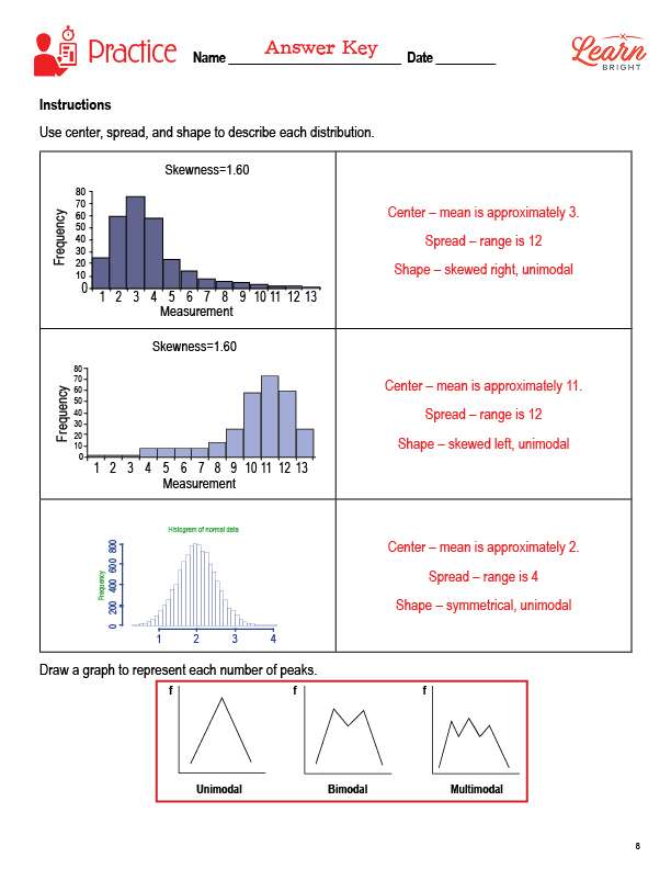
The practice worksheet asks students to use the center, spread, and shape to describe three different distributions. They will also draw graphs to represent different numbers of peaks.
DATA COLLECTION AND DISTRIBUTION HOMEWORK ASSIGNMENT
For the homework assignment, students will select the correct answer to five different questions.
Worksheet Answer Keys
This lesson plan includes answer keys for the practice worksheet and the homework assignment. If you choose to administer the lesson pages to your students via PDF, you will need to save a new file that omits these pages. Otherwise, you can simply print out the applicable pages and keep these as reference for yourself when grading assignments.