

Description
What our Interpreting and Representing Data (Grades 1-2) lesson plan includes
Lesson Objectives and Overview: Interpreting and Representing Data (Grades 1-2) presents graphs and helps students understand why we use them. Organizing data into a graph helps us to see the information quickly and be able to interpret or make predictions about the data. Parts of a graph, including the x- and y-axis, are explained as part of the lesson. At the end of the lesson, students will be able to organize, represent, and analyze data in a bar chart. This lesson is for students in 1st grade and 2nd grade.
Classroom Procedure
Every lesson plan provides you with a classroom procedure page that outlines a step-by-step guide to follow. You do not have to follow the guide exactly. The guide helps you organize the lesson and details when to hand out worksheets. It also lists information in the blue box that you might find useful. You will find the lesson objectives, state standards, and number of class sessions the lesson should take to complete in this area. In addition, it describes the supplies you will need as well as what and how you need to prepare beforehand.
Options for Lesson
Included with this lesson is an “Options for Lesson” section that lists a number of suggestions for activities to add to the lesson or substitutions for the ones already in the lesson. One optional addition to this lesson is to have your students use any object they can sort to make a graph. You can also have your students answer a short questionnaire at the beginning of class and create graphs as a group so that they understand how to represent and organize the data. As part of that activity, you could also have students create posters for each question or have them ask each other questions about the graphs.
Teacher Notes
The teacher notes page includes lines that you can use to add your own notes as you’re preparing for this lesson.
INTERPRETING AND REPRESENTING DATA (GRADES 1-2) LESSON PLAN CONTENT PAGES
Interpreting and Representing Data
The Interpreting and Representing Data (Grades 1-2) lesson plan includes two content pages. The lesson opens with a table that shows the answers students gave when asked what their favorite season of the year is. When you look at this information written out and in a table, it can be overwhelming! To find out how many students like spring the best, we would have to count each time “spring” appeared in the table one-by-one. This can be inconvenient and time-consuming (or even impossible!) depending on the number of responses you have. What if you had 1,000 responses? Would you want to go through each response one-by-one? Organizing data into graphs can help us see and interpret the information quickly. We can use graphs to make predictions about the data as well.
The lesson shows the students’ favorite seasons as a bar graph. Looking at the bar graph, it’s easy to determine how many students like spring best. To do so, we first look at the categories at the bottom to find “Spring”. Then, we follow that bar to the top and look at the number the left. The bar stops at the number 6, so we know that 6 students like spring the best!
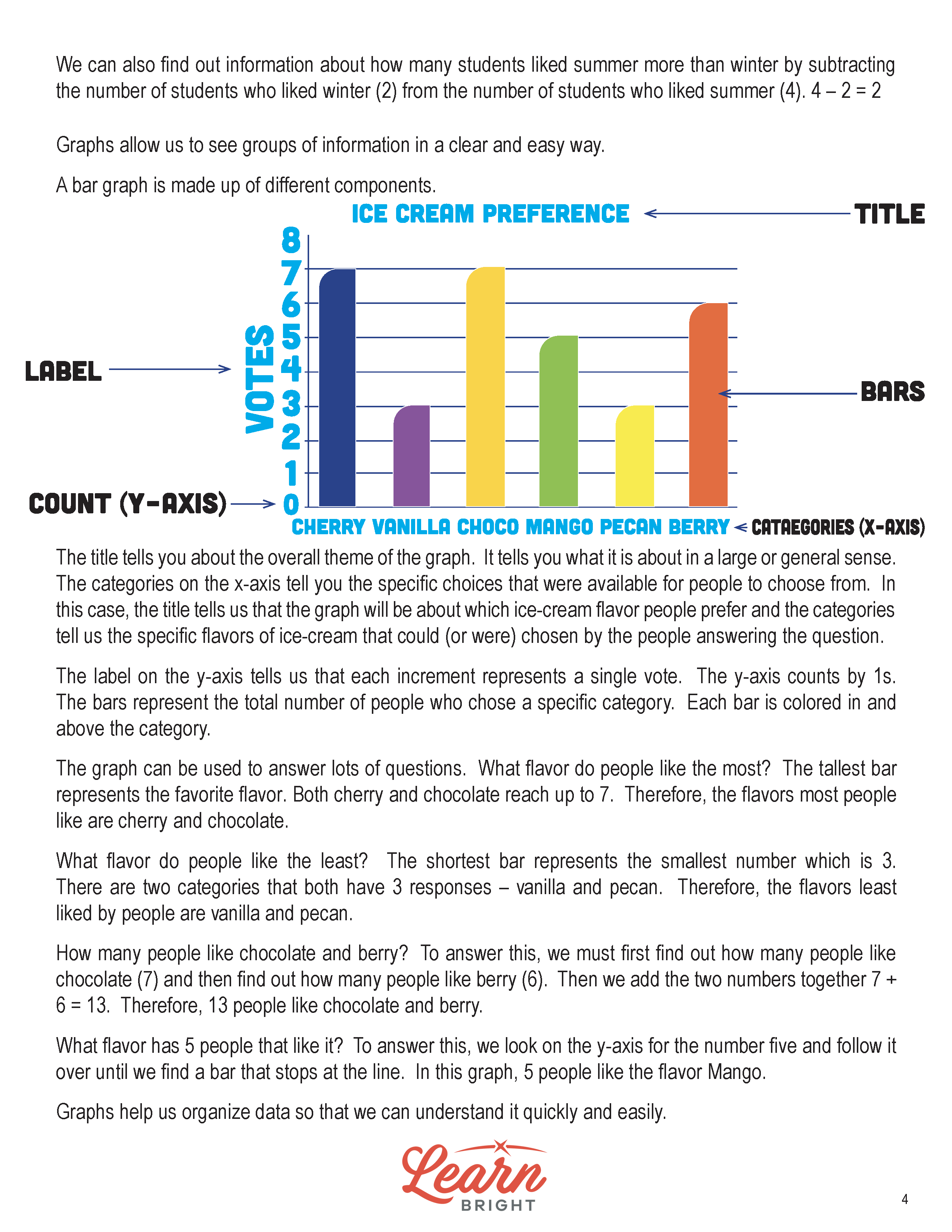
We can learn many things using this graph, including the total number of students asked. To figure this out, we simply need to add together all of the responses. By doing this, we see that 15 students were asked. We can also find out how many students like summer more than winter by subtracting the number of students who like winter (2) from the number of students who like summer (4): 4 – 2 = 2, so 2 more students like summer more!
Bar Graphs
Bar graphs contain several different parts. The lesson walks through each part using an example graph that shows Ice Cream Preference. First, bar graphs must include a title. The title tells you the overall theme or topic of the graph. In this example, the title is “Ice Cream Preference”. Next, they include an x-axis and y-axis. The categories listed along the x-axis (Cherry, Vanilla, Chocolate, Mango, Pecan, and Berry in the example) tell you the different choices or answers given to people. The label on the y-axis tells us what we’re counting. In the example, the y-axis is labelled “Votes”, so we know that each increment represents a single vote. The y-axis is also labeled in increments of 1.
Bar graphs also have bars! Each bar represents the total number of people who chose a specific category or answer. In the example, each bar represents the number of people who chose each ice cream flavor.
We can use bar graphs to answer many different questions. For example, looking at the Ice Cream Preference bar graph, we could ask what flavor people like the most. The tallest bar represents the most popular flavor. Looking at the graph, we can see that both cherry and chocolate are the highest at 7 votes each, so they are the flavors people like the most! What flavor do people like the least? Both vanilla and pecan are the shortest bars at 3 votes each, so they’re the least popular flavors.
How many people like chocolate and berry? To answer this, we first determine how many people voted for chocolate (7) and then how many people voted for berry (6). Then, we add the two numbers together: 7 + 6 = 13. Now we know that 13 people like chocolate and berry!
Finally, what flavor has 5 people that like it? To find this out, we can look on the y-axis for the number 5 and follow it over until we find a bar that stops at the line. In this example, we can see that 5 people like the flavor mango.
You can answer so many different questions using a bar graph! Graphs of all kinds help us organize our data so we can use and interpret it more easily.
INTERPRETING AND REPRESENTING DATA (GRADES 1-2) LESSON PLAN WORKSHEETS
The Interpreting and Representing Data (Grades 1-2) lesson plan includes four worksheets: an activity worksheet, a practice worksheet, a homework assignment, and a quiz. You can refer to the guide on the classroom procedure page to determine when to hand out each worksheet.
LUCKY CHARMS ACTIVITY WORKSHEET
The activity worksheet asks students to sort bags of Lucky Charms cereal by their shapes. They will then create a bar graph and answer questions about their data.
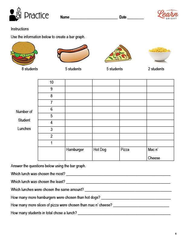
CREATE A BAR GRAPH PRACTICE WORKSHEET
For the practice worksheet, students will use the information provided to create a bar graph. They will then answer questions about their bar graph.
INTERPRETING AND REPRESENTING DATA HOMEWORK ASSIGNMENT
Like the practice worksheet, for the homework assignment, students will use the information provided to create a bar graph. They will then answer questions about their bar graph.
QUIZ
This lesson also includes a quiz that you can use to test students’ understanding of the lesson material. For the quiz, students will look at a bar graph and answer five questions about it.
Worksheet Answer Keys
This lesson plan includes answer keys for the practice worksheet, the homework assignment, and the quiz. If you choose to administer the lesson pages to your students via PDF, you will need to save a new file that omits these pages. Otherwise, you can simply print out the applicable pages and keep these as reference for yourself when grading assignments.