
Description
What our Scatter Plots and Histograms lesson plan includes
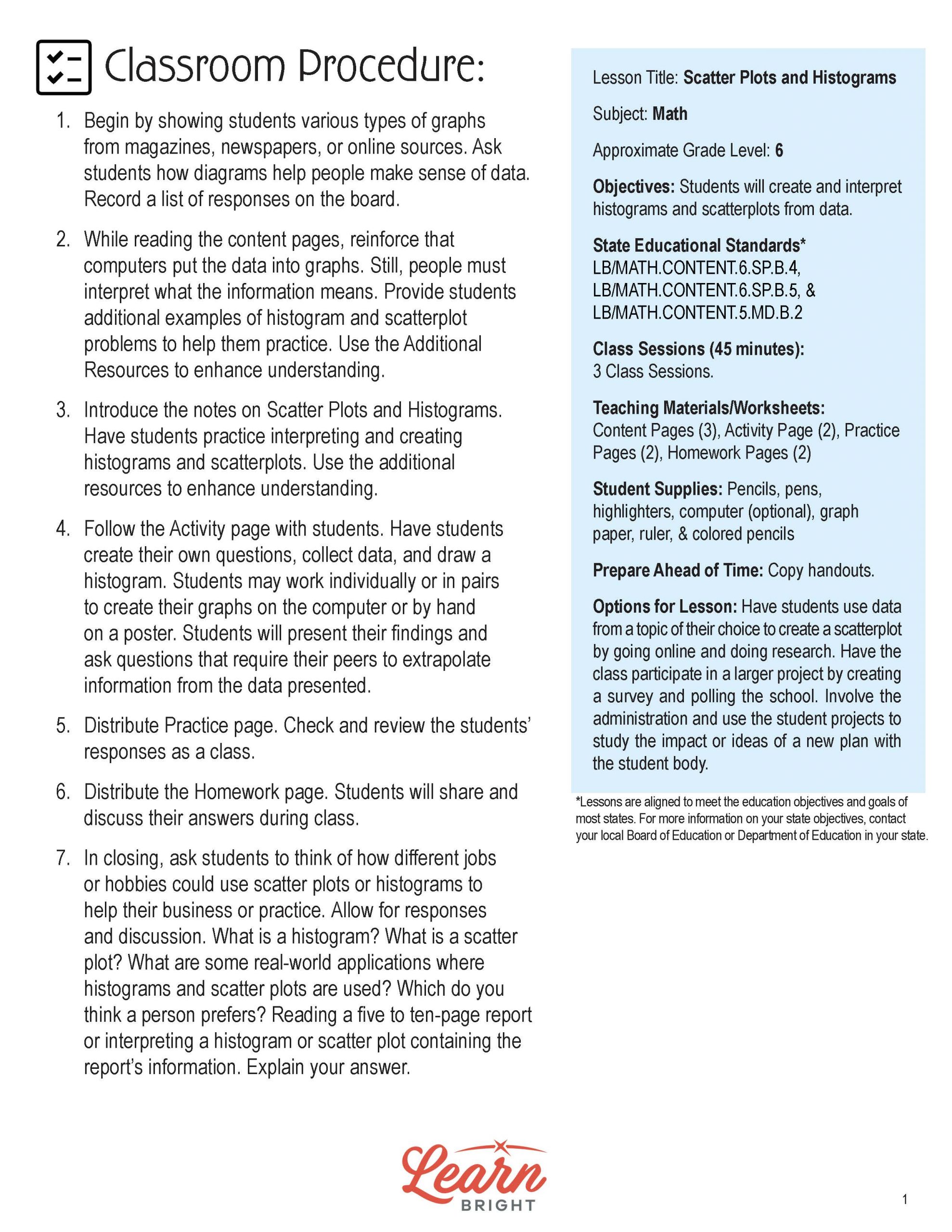
Lesson Objectives and Overview: Scatter Plots and Histograms introduces students to both types of graphs and how to make them. By the end of the lesson, students will be able to create and interpret histograms and scatterplots from data. This lesson is for students in 6th grade.
Classroom Procedure
Every lesson plan provides you with a classroom procedure page that outlines a step-by-step guide to follow. You do not have to follow the guide exactly. The guide helps you organize the lesson and details when to hand out worksheets. It also lists information in the blue box that you might find useful. You will find the lesson objectives, state standards, and number of class sessions the lesson should take to complete in this area. In addition, it describes the supplies you will need as well as what and how you need to prepare beforehand. The supplies you need for this lesson include pencils, pens, highlighters, graph paper, ruler, and colored pencils.
Options for Lesson
Included with this lesson is an “Options for Lesson” section that lists a number of suggestions for activities to add to the lesson or substitutions for the ones already in the lesson. One optional addition to this lesson is to have your students use data from a topic of their choice to create a scatterplot by going online and doing research. You could also have your whole class participate in a larger project where they create a survey and poll the school. Finally, you could involve your school’s administration and use the student projects to study the impact or ideas of a new plan with the student body.
Teacher Notes
The teacher notes page includes a paragraph with additional guidelines and things to think about as you begin to plan your lesson. This page also includes lines that you can use to add your own notes as you’re preparing for this lesson.
SCATTER PLOTS AND HISTOGRAMS LESSON PLAN CONTENT PAGES
Histograms
The Scatter Plots and Histograms lesson plan includes three content pages. It begins by explaining that histograms are a type of graph for organizing statistical data. These graphs look like bar charts with columns that touch each other. The columns represent ranges of data instead of single numbers or categories.
Four Steps to Create a Histogram
The lesson walks students through the four steps to create a histogram. The first step is to collect the data, the second step is to create categories, the third step is to draw the graph, and the last step is to observe and analyze the shape.
Next, the lesson goes through each step in detail. The first step is to collect the data, which can be any numerical value. Some examples of numerical data include the number of shoes owned or the number of pets someone has. This is numerical, not categorical, information. Some examples of categorical data include the brand of shoes owned or the type of pet you have. Numerical data in a classroom could be the ages of the people in the class, but not their favorite brand of shoes (which is categorical data).
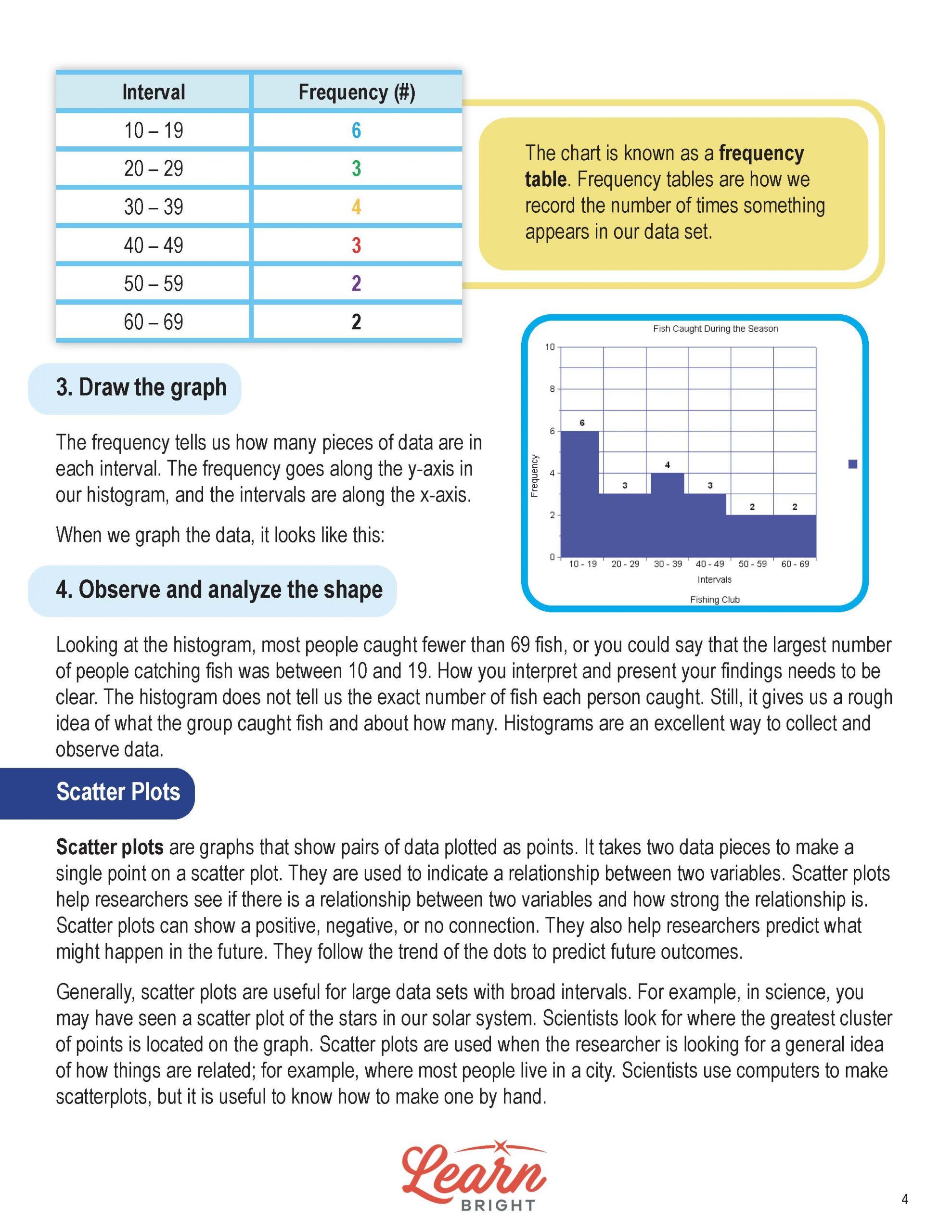
The lesson includes an example of a set of data that tells how many fish each person in a fishing club caught during their fishing season.
The second step is to create categories, which we also call intervals. We determine the interval by looking at both the highest and lowest values in the data and figuring out which interval makes the most sense. If your lowest value is 12 and your highest value is 64, for example, you could use intervals of 10. You want the gaps to not be too broad or narrow.
We call the number of times each number is in a group of data the frequency. The lesson illustrates this with the numbers from the fishing group example. They group the numbers by interval. For example, the first interval is 10-19. The frequency is 6, because six people caught between 10 and 19 fish.
The third step is to draw the graph. Now that we have the frequency, we know how many pieces of data each interval includes. We put the frequency along the y-axis and the intervals along the x-axis. The lesson shows the finished graph.
Finally, the fourth step is to observe and analyze the shape of the graph. When you look at the histogram, you can see that most people caught fewer than 69 fish. The largest number of people catching fish was between 10 and 19. The histogram does not tell us the exact number of fish each person caught, but it gives us a rough idea of how many fish the group caught. Histograms are a helpful way to collect and observe data.
Scatter Plots
Scatter plots, on the other hand, are graphs showing pairs of data plotted as points. You need two pieces of data to create a single point on a scatter plot. We use them to indicate relationships between two variables. Researchers use them to help see relationships between two variables and how strong those relationships are. Scatter plots show positive, negative, or no connections. Researchers also use them to help predict what might happen in the future, following the trend of the dots to predict future outcomes.
People usually use scatter plots for large data sets that have broad intervals. In science, for example, they might use a scatter plot for the stars in the solar system. They look for large clusters of points on the graph, and they use them to get a general sense of how things relate to each other. Most scientists use computers to create their scatter plots, but it’s also useful to know how to create one by hand. You can use scatter plots for small datasets, but they’re not great for illustrating information visually.
Steps to Create a Scatter Plot
The lesson next walks students through the process of creating a scatter plot. First, you need to determine your independent (one that you change) and dependent (one that varies based on the independent variable) variables. If you want to look at height and weight and how they’re related, height would be your independent variable and weight would be your dependent variable. After choosing your variables, you label the x-axis with the independent variable and the y-axis with the dependent variable. Next, you’ll plot each point on the graph. Finally, you’ll label the x- and y-axis and give your graph a title.
SCATTER PLOTS AND HISTOGRAMS LESSON PLAN WORKSHEETS
The Scatter Plots and Histograms lesson plan includes three worksheets: an activity worksheet, a practice worksheet, and a homework assignment. You can refer to the guide on the classroom procedure page to determine when to hand out each worksheet.
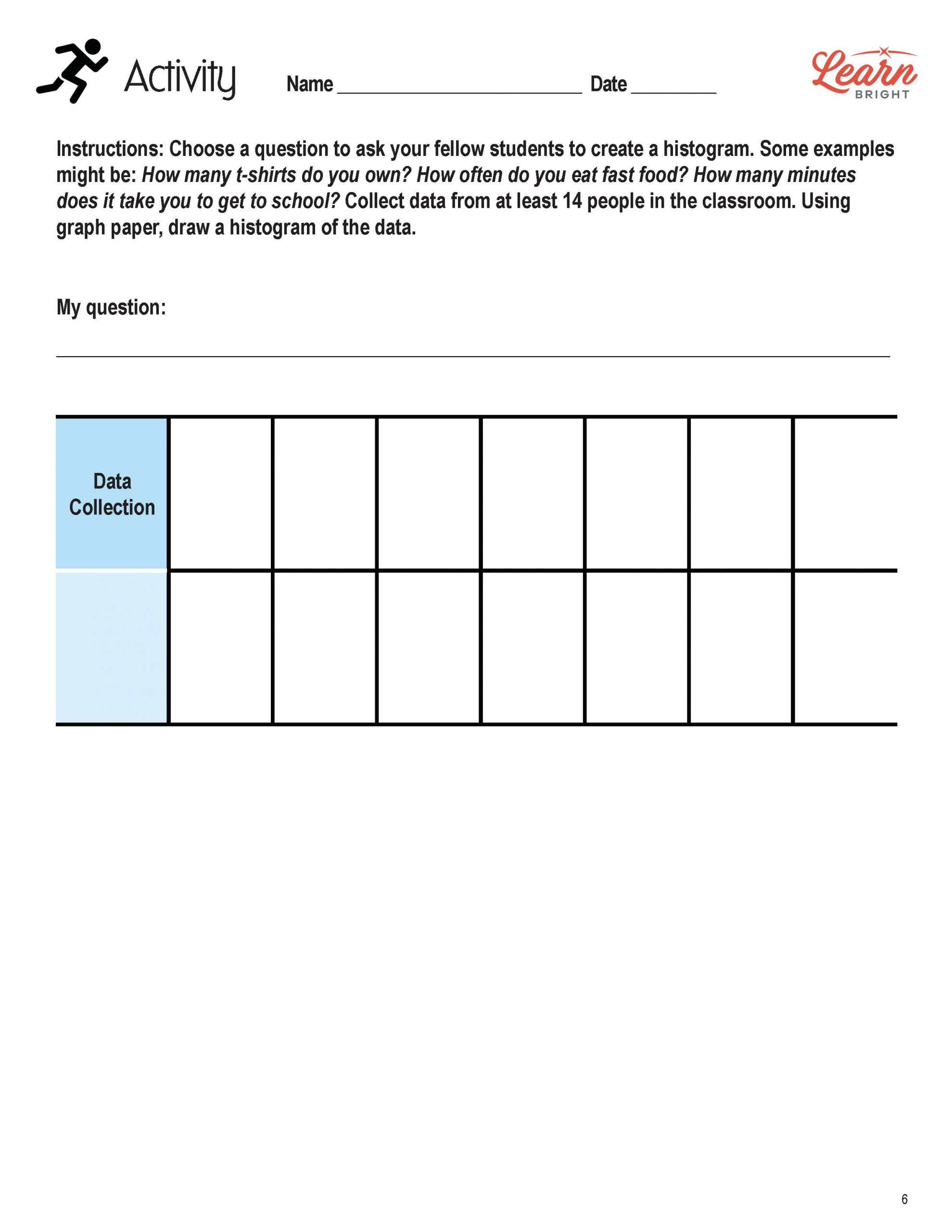
CREATING A HISTOGRAM ACTIVITY WORKSHEET
For the activity worksheet, students will choose a question to ask their fellow students and will create a histogram based on the data they collect. They should collect at least 14 data points and use graph paper to draw their histogram.
HISTOGRAMS PRACTICE WORKSHEET
The practice worksheet asks students to look at four different histograms and answer questions about them.
SCATTER PLOTS AND HISTOGRAMS HOMEWORK ASSIGNMENT
For the homework assignment, students will look at a scatter plot and answer questions about it, testing their understanding of the lesson material.
Worksheet Answer Keys
This lesson plan includes answer keys for the activity worksheet, the practice worksheet, and the homework assignment. If you choose to administer the lesson pages to your students via PDF, you will need to save a new file that omits these pages. Otherwise, you can simply print out the applicable pages and keep these as reference for yourself when grading assignments.